May 22, 2024

At Airsign, we specialize in aerial advertising that enhances your brand visibility in key target areas. In this blog post, we’ll share essential tips and best practices to ensure your helicopter banner ads grab attention and deliver results.
Keep It Simple and Uncluttered
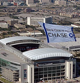
When crafting helicopter banner ads, simplicity should be your guiding principle. Avoid cluttering your ad with excessive text or intricate graphics, as this can overwhelm viewers and obscure your message. Instead, opt for a clean and minimalistic design that clearly communicates your campaign, offer, or tagline.
Utilizing whitespace effectively helps to highlight the key elements of your ad, ensuring your message is both memorable and easy to comprehend.
Use Clear, Bold Typography for Enhanced Readability
Readability is paramount in helicopter banner ads. You have mere seconds to capture viewers’ attention, so it’s essential to make every word count.
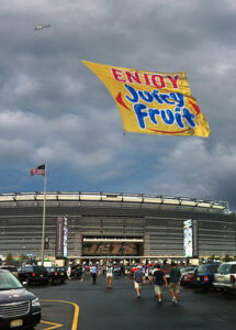
Utilize a standardized, bold font that can be easily read from a distance. Additionally, ensure that your font color sharply contrasts with the banner background to enhance visibility, making your message stand out.
Incorporate High-Quality Graphics and Images
Compelling visuals can elevate your helicopter banner ad’s impact. Choose high-resolution images that are relevant to your message to create a visually engaging experience for your audience.
Avoid overly complex visuals that might distract from your core message. Instead, opt for striking yet simple graphics that complement your text and reinforce your brand identity.
Design for Movement
As helicopter banners are constantly in motion, it’s important to design them with movement in mind. Select eye-catching design elements that will grab attention as the banner glides slowly overhead.
Our team will collaborate with you to ensure that your graphics and overall design enhance your message’s visibility, creating a helicopter banner ad that truly commands attention.

Maintain Brand Consistency Across All Elements
Consistency is crucial for building brand recognition and trust. Ensure all design components align with your brand identity, including fonts, colors, logos, and imagery. Consistency in messaging, tone, and visual style across your ad creates a cohesive brand experience and boosts recognition.
Optimize Contrast for Maximum Legibility
Given the brief viewing time for helicopter banner ads, optimizing the contrast between text and background is essential for legibility. Choose font colors that stand out against the backdrop and avoid combinations that may cause eye strain.
We’ll help you select contrast levels that ensure your message remains clear and readable under various lighting conditions.
Include a Clear Call-to-Action
A compelling call-to-action (CTA) is vital for driving viewer engagement. Whether you want them to visit a website, download an app, or attend an event, your CTA should be concise, specific, and prominently featured.
Utilize action-oriented language and visually distinct elements, such as bold website URLs or arrows, to direct attention to the CTA. Ensure it stands out from the rest of the ad for maximum recognition.
Ensure Scalability for Different Banner Sizes
Helicopter banner ads come in various sizes, depending on the helicopter and banner configuration. It’s essential to design your ad to be scalable and adaptable across different sizes without sacrificing visual appeal or message clarity.
Utilize vector graphics or high-resolution images that can be resized without loss of quality. Test the scalability of your design on various banner sizes to ensure effectiveness and visual appeal.

Limit Text to Essential Information
Space is limited on helicopter banner ads, and viewers only have a fleeting moment to absorb the message. Focus on conveying the core message and key details, such as the brand name, offer, and call-to-action. Eliminate unnecessary text or overly detailed explanations that may confuse or distract viewers.
Utilize Contrasting Colors for Enhanced Visibility
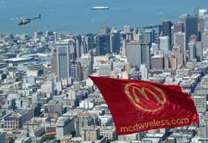
Contrast is key to ensuring your helicopter banner ad stands out against the sky or other backgrounds. Use contrasting colors for text, graphics, and background elements to improve visibility and legibility.
Select colors that create a strong visual impact, making your message pop against the background. For example, opt for light-colored text on a dark background or vice versa to maximize contrast. Avoid color combinations that lack sufficient differentiation, as they may hinder readability.
Design with the Viewing Angle in Mind
The viewing angle of helicopter banner ads can vary based on factors such as altitude and distance. Therefore, design your ad to ensure maximum visibility from different perspectives.
Position key elements, such as text and visuals, so they are easily recognizable from various angles and distances. Consider how the ad will appear as the helicopter approaches, passes overhead, and moves away to guarantee clarity and engagement at all viewpoints.
Create a Sense of Urgency with Limited-Time Offers
Leverage the power of urgency by incorporating time-sensitive offers or promotions in your helicopter banner ads. Use compelling language and visuals to convey the urgency and benefits of acting quickly.
Partner with Airsign for Aerial Advertising Success
With decades of experience in aerial advertising, our Airsign team is equipped to help you design impactful helicopter banner ads that resonate with your target audience.
Contact us today for a FREE consultation and let us elevate your brand visibility with our aerial advertising solutions!
